


Uncategorized
The Secret to Perfect Wardrobe Color Combinations Revealed
Feb
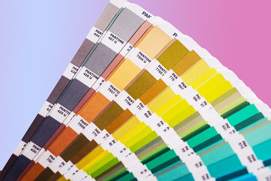
The color wheel is a fundamental tool for understanding how colors relate to each other. It is a circular diagram that organizes colors based on their relationships and is divided into three categories: primary, secondary, and tertiary colors. Primary colors are red, blue, and yellow, and they cannot be created by mixing other colors. Secondary colors are created by mixing two primary colors together, such as green (blue and yellow), orange (red and yellow), and purple (blue and red). Tertiary colors are created by mixing a primary color with a secondary color, resulting in shades like red-orange, yellow-green, and blue-violet.
The color wheel also demonstrates the concept of warm and cool colors. Warm colors include red, orange, and yellow, and are associated with energy and excitement. Cool colors, on the other hand, include blue, green, and purple, and are often linked to calmness and relaxation. Understanding the color wheel can help individuals create harmonious color combinations in their wardrobe and interior design choices.
Complementary Color Combinations
Complementary colors are pairs of colors that are located directly across from each other on the color wheel. When used together, they create a high contrast and vibrant look. Examples of complementary color combinations include red and green, blue and orange, and yellow and purple. These combinations can be used to create eye-catching outfits or interior design schemes. When using complementary colors in fashion, it’s important to consider the intensity of the colors. For example, pairing a bright red with a deep green can create a bold and striking look, while using a softer shade of red with a muted green can result in a more subtle and sophisticated combination.
In interior design, complementary color combinations can be used to create focal points or add visual interest to a space. For example, using blue and orange accents in a predominantly white room can create a dynamic and energetic atmosphere. When incorporating complementary colors into your wardrobe or home decor, it’s important to consider the overall mood and style you want to achieve.
Monochromatic Color Schemes
Monochromatic color schemes involve using variations of a single color to create a cohesive and harmonious look. This can be achieved by using different shades, tints, and tones of the same color. For example, a monochromatic outfit might include different shades of blue, such as navy, sky blue, and baby blue. In interior design, a monochromatic color scheme can create a sense of unity and sophistication. Using different shades of gray in a living room, for example, can result in a sleek and modern aesthetic.
When using a monochromatic color scheme, it’s important to consider texture and pattern to add visual interest. Incorporating different textures like velvet, silk, or wool can add depth to an outfit or interior space. Additionally, using patterns like stripes or polka dots can break up the monotony of a single color palette. Monochromatic color schemes are versatile and timeless, making them a popular choice for both fashion and interior design.
Analogous Color Pairings
Analogous color pairings involve using colors that are adjacent to each other on the color wheel. This creates a harmonious and cohesive look that is pleasing to the eye. For example, using shades of blue-green, green, and yellow-green in an outfit or interior design scheme can create a serene and calming atmosphere. Analogous color pairings are often found in nature, such as the varying shades of green in a forest or the warm tones of a sunset.
When using analogous color pairings in fashion, it’s important to consider the undertones of the colors. For example, pairing a cool-toned blue with a warm-toned green may result in a jarring combination. In interior design, analogous color pairings can be used to create a sense of flow and continuity throughout a space. Using varying shades of purple in a bedroom, for example, can create a relaxing and tranquil environment.
Triadic Color Harmony
Triadic color harmony involves using three colors that are evenly spaced around the color wheel. This creates a balanced and vibrant look that is visually appealing. Examples of triadic color combinations include red, yellow, and blue or orange, green, and purple. When using triadic color harmony in fashion, it’s important to consider the intensity of the colors. Pairing three bold and bright colors together can create a lively and energetic outfit, while using softer shades can result in a more subdued look.
In interior design, triadic color harmony can be used to create a dynamic and engaging space. Using varying shades of red, yellow, and blue in a living room can create a playful and cheerful atmosphere. When incorporating triadic color harmony into your wardrobe or home decor, it’s important to consider the overall mood and style you want to achieve.
Incorporating Neutrals
Neutrals are colors that are not found on the traditional color wheel and include shades like white, black, gray, brown, and beige. Neutrals are versatile and timeless, making them an essential part of any wardrobe or interior design scheme. In fashion, neutrals can be used as a base for creating cohesive outfits. For example, pairing black pants with a white blouse creates a classic and sophisticated look. In interior design, neutrals can be used to create a sense of balance and calmness in a space. Using varying shades of gray in a bedroom can result in a serene and tranquil environment.
When incorporating neutrals into your wardrobe or home decor, it’s important to consider texture and pattern to add visual interest. Mixing different textures like leather, linen, or wool can add depth to an outfit or interior space. Additionally, using patterns like herringbone or chevron can break up the monotony of a neutral color palette. Neutrals are versatile and can be used as a foundation for creating both bold and understated looks.
Tips for Experimenting with Color in Your Wardrobe
Experimenting with color in your wardrobe can be an exciting way to express your personal style and creativity. Here are some tips for incorporating color into your outfits:
1. Start small: If you’re new to experimenting with color, start by incorporating small pops of color into your outfits with accessories like scarves, jewelry, or shoes.
2. Mix and match: Don’t be afraid to mix different colors together to create unique and unexpected combinations. Experiment with complementary or analogous color pairings to create visually interesting outfits.
3. Consider your skin tone: When choosing colors for your wardrobe, consider how they complement your skin tone. Warm-toned individuals may look best in earthy tones like reds, oranges, and yellows, while cool-toned individuals may look best in blues, greens, and purples.
4. Play with patterns: Incorporating patterns into your outfits can add depth and visual interest. Mix different patterns together or pair them with solid colors for a bold look.
5. Have fun: Above all, have fun with experimenting with color in your wardrobe! Don’t be afraid to step out of your comfort zone and try new combinations that reflect your personality and style.
In conclusion, understanding the color wheel and different color combinations can help individuals create harmonious and visually appealing outfits and interior design schemes. Whether you prefer monochromatic looks or bold triadic combinations, experimenting with color is a fun way to express your personal style and creativity. By incorporating these tips into your wardrobe or home decor, you can confidently embrace the world of color and create looks that reflect your unique personality.